/
Blog


Master Gradient Text Animations: A Beginner-Friendly Guide with CSS
Learn how to create stunning gradient text animations with smooth hover effects using simple CSS. Perfect for beginners, this guide provides step-by-step instructions and customization tips to enhance your website design

3 min read
0 Views
Creating visually appealing elements is a key part of web design, even for beginners who are just starting their coding journey. In this article, we’ll walk you through how to implement a simple yet eye-catching gradient text animation in CSS. No prior experience is required—this guide is detailed and beginner-friendly.
Try to get the code with this PlayGround
What You Will Learn
- How to create gradient text using CSS.
- How to add smooth transitions for hover effects.
- Key CSS properties like background-clip, text-fill-color, and transition.
Step-by-Step Guide
Let’s create a text element with a beautiful gradient color that changes smoothly when hovered over.
Step 1: Set Up Your HTML
First, create a basic HTML structure. Add a div element with a class name like text-gradient-purple-coral. This class will be styled later.
<!DOCTYPE html>
<html lang="en">
<head>
  <meta charset="UTF-8">
  <meta name="viewport" content="width=device-width, initial-scale=1.0">
  <title>Gradient Text Animation</title>
  <link rel="stylesheet" href="styles.css">
</head>
<body>
  <div class="text-gradient-purple-coral">Hover Over This Text</div>
</body>
</html>- Explanation:
The div is the container for the text we want to style. In this example, the text says “Hover Over This Text.”
Step 2: Write the CSS
Now let’s add the CSS to create the gradient text effect. Open a file named styles.css and include the following code:
.text-gradient-purple-coral {
  font-size: 2.5rem; /* Makes the text large and noticeable */
  font-weight: bold; /* Adds emphasis to the text */
  background: -webkit-linear-gradient(-70deg, #8250df, #d42a32); /* Gradient colors */
  -webkit-background-clip: text; /* Ensures the gradient is clipped to the text */
  -webkit-text-fill-color: transparent; /* Makes the background gradient visible */
  -webkit-box-decoration-break: clone; /* Ensures proper decoration for wrapped text */
  transition: all 2s ease-in-out 0.5s; /* Smooth transition for hover effects */
}

/* Hover effect */
.text-gradient-purple-coral:hover {
  background: -webkit-linear-gradient(-70deg, #f40915, #380d88); /* New gradient colors on hover */
  -webkit-background-clip: text;
  -webkit-text-fill-color: transparent;
  transition: all 2s ease-in-out 0.5s;
}
Key CSS Properties Explained
Here’s a detailed breakdown of what each CSS property does:
1. -webkit-linear-gradient:
This defines the gradient colors. In the example above, #8250df (a purple shade) transitions to #d42a32 (a coral red). The -70deg sets the gradient angle.
2. -webkit-background-clip: text:
This ensures the gradient is applied only to the text.
3. -webkit-text-fill-color: transparent:
Makes the text’s fill transparent, so the gradient background becomes visible.
4. transition:
Adds a smooth effect when the gradient changes on hover.
- 2s: Specifies the transition duration (2 seconds).
- ease-in-out: Makes the animation smooth both at the start and end.
- 0.5s: Adds a slight delay before the animation begins.
5. Hover Effect:
When the user hovers over the text, the gradient changes to a new combination (#f40915 to #380d88) with the same smooth transition.
Step 3: Test and View
- Save your index.html and styles.css files.
- Open the index.html file in a browser.
- Move your mouse over the text to see the gradient smoothly change.
Customizing the Effect
You can personalize this effect by:
- Changing the Gradient Colors:
- Replace the hex codes (#8250df, #d42a32, etc.) with your favorite colors.
- Modifying the Transition Timing:
- Experiment with transition-duration (e.g., 1s, 3s) and transition-delay (e.g., 0s, 0.3s) to find the animation speed and delay that suit your design.
- Adjusting Text Size:
- Use the font-size property to make the text larger or smaller. Example: font-size: 3rem;.
Final Code
Here’s the complete code for your reference:
HTML
<!DOCTYPE html>
<html lang="en">
<head>
  <meta charset="UTF-8">
  <meta name="viewport" content="width=device-width, initial-scale=1.0">
  <title>Gradient Text Animation</title>
  <link rel="stylesheet" href="styles.css">
</head>
<body>
  <div class="text-gradient-purple-coral">Hover Over This Text</div>
</body>
</html>
CSS
.text-gradient-purple-coral {
  font-size: 2.5rem;
  font-weight: bold;
  background: -webkit-linear-gradient(-70deg, #8250df, #d42a32);
  -webkit-background-clip: text;
  -webkit-text-fill-color: transparent;
  -webkit-box-decoration-break: clone;
  transition: all 2s ease-in-out 0.5s;
}

.text-gradient-purple-coral:hover {
  background: -webkit-linear-gradient(-70deg, #f40915, #380d88);
  -webkit-background-clip: text;
  -webkit-text-fill-color: transparent;
  transition: all 2s ease-in-out 0.5s;
}
Why This Matters for Beginners
- Simplicity:
- This example uses basic HTML and CSS, making it a perfect starting point for learning about gradients and animations.
- Visual Appeal:
- Interactive elements like gradient animations make websites more engaging.
- Reusable Skills:
- The transition and clip-path properties can be used in many other projects, such as buttons, banners, and backgrounds.
Conclusion
Creating dynamic gradient effects with hover animations is an easy way to enhance your website’s design. With just a few lines of CSS, you can add a professional and polished look to your projects. Try experimenting with colors and timings to make it uniquely yours!

Related Posts

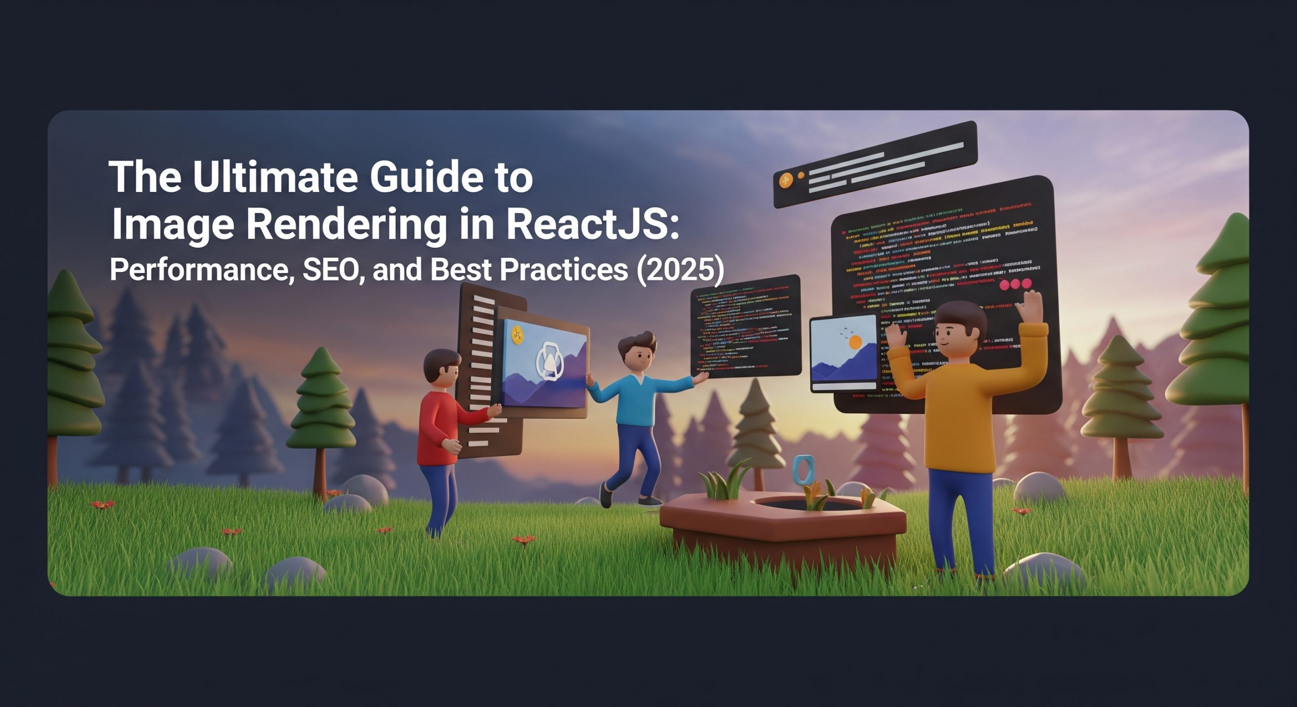
Overview: The Critical Role of Images in Modern Web Development Images are fundamental to web experiences, accounting for approximately 50% of a typical webpage’s total size. How you choose to render these assets significantly impacts user experience, page performance, and search engine rankings. As web technologies evolve, developers have multiple options for implementing images in […]
 Essential Responsive Design Tips for React Developers
Creating truly responsive web applications that work perfectly from small 320px mobile screens to 4K displays requires a strategic approach. This guide provides practical

A high-performance React component that creates an engaging coin celebration animation using Framer Motion. Features dynamic particle systems, smooth transitions, and interactive effects perfect for gaming applications, reward celebrations, and interactive web experiences. Built with React 18+ and Framer Motion.
Stop Debugging React Blindly: Meet React Debugger Extension A powerful Chrome DevTools extension that makes debugging React applications feel less like guesswork and more like detective work. The Problem Every React Developer Faces We’ve all been there. Your React app is slow. Components re-render for no apparent reason. Memory usage keeps climbing. Layout shifts ruin […]

Nhật ký hậu trường: Vì sao debug React khiến tôi cạn kiệt năng lượng – và React Debugger đã kéo tôi ra khỏi vòng lặp vô tận đó Có một ngày thứ Ba tưởng như bình thường: tôi nhận một báo cáo khá mơ hồ – trang thanh toán Next.js đôi lúc trắng xóa khi […]

In modern web development, creating lively and exciting user experiences (UX) requires more than just simple CSS transitions. We need complex, interactive animations that look great but don’t slow down the app. This is why Rive has become a powerful “secret weapon” in our technology stack. Today, let’s explore the full process of using Rive […]
Subscribe to our newsletter
Get the latest posts delivered right to your inbox